EmployeeBook - Rethinking a Talent Management System
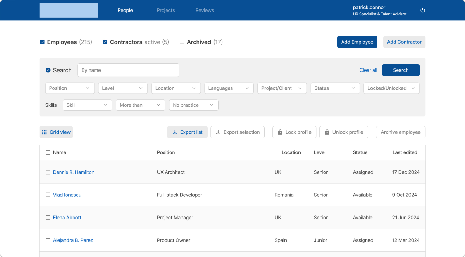
EmployeeBook was a recently introduced internal ERP module for HR and talent management professionals, but adoption among HR employees remained low. This delayed filling internal vacancies and led to staffing issues on major projects. At first glance the project seemed straightforward, but things turned out more complex.
I led the platform's redesign and owned the research process end-to-end alongside two junior designer who supported me. I ran interviews, handled stakeholder calls, and shaped priorities based on my research findings. Design decisions were validated through user feedback and a continuous, iterative process.

- Role
- Lead Product Designer
- Date
- 2025
- Team
- 3 designers
- Platform
- Desktop
01 // Research
Talking to the users
To understand the root cause of the problem, I conducted seven open-ended user interviews with employees from across various departments.
What first caught my eye was that employees and stakeholders viewed the platform's issues totally different. Stakeholders initially assumed that people just needed more time to adjust, but employees had clear, specific reasons for not using it which they were eager to talk about.
"Sometimes when I use the search bar the screen goes completely blank, and I'm just sitting there wondering if I hadn't done something wrong."
"The search bar is hidden behind a dropdown menu and I often have trouble finding it. Can't it just be more visible, like on other platforms?"
"I wish the platform wasn't so confusing to use. I've used similar platforms in the past and I never had this much trouble getting things done."
Mapping the insights
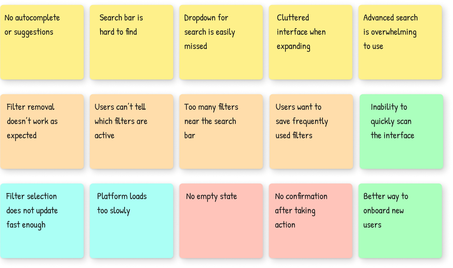
I noticed the same five major themes recurring across the interviews, so I structured my findings around them. This revealed the problems were more complex than initially assumed, but also that they were highly fixable.
Making the problem visible
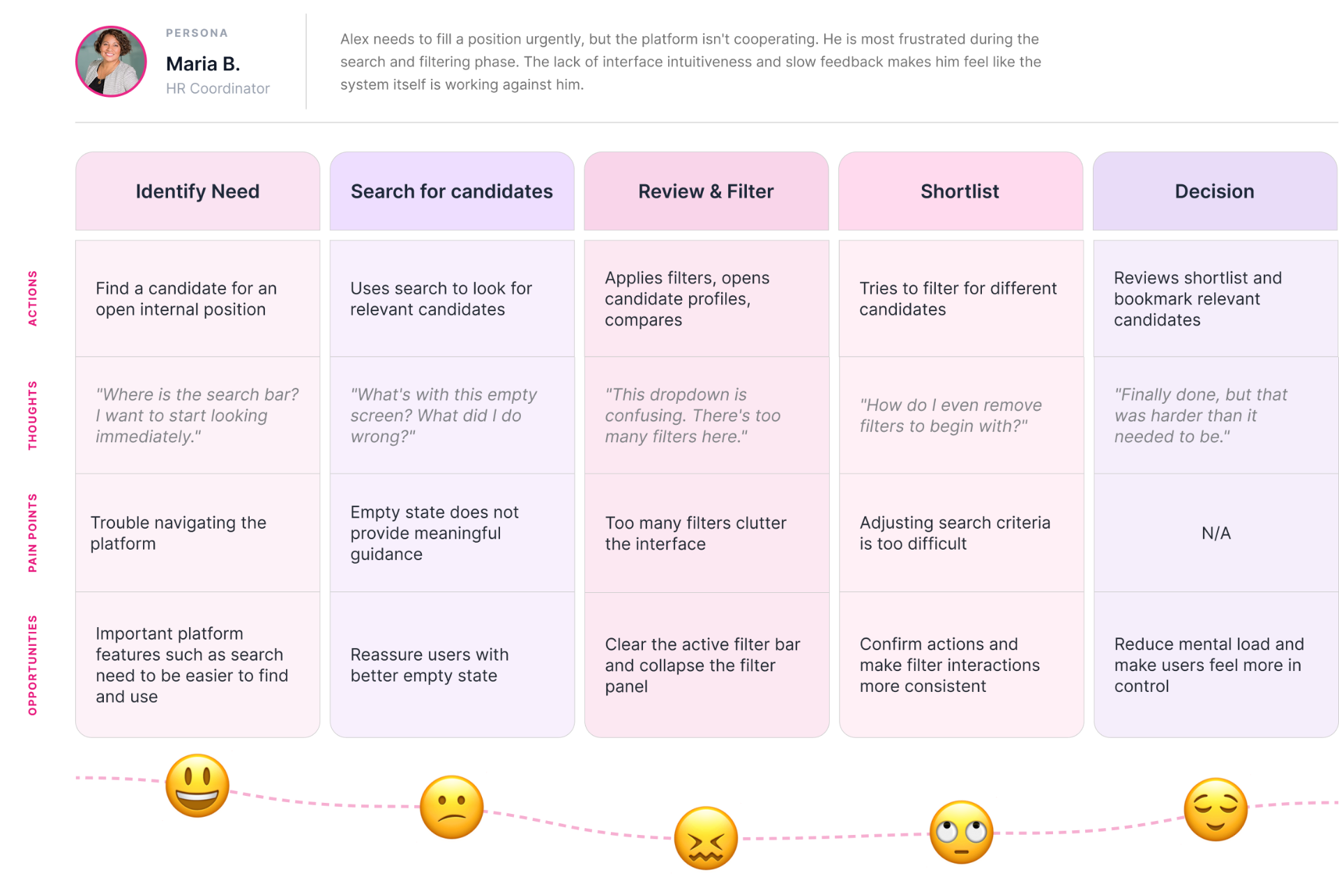
Once the insights became a journey map, stakeholders could finally see what employees had been talking about all along. Complaints turned into friction points with clear locations, and the places where users got stuck stood out. That made the "they just need to adjust" argument much weaker.
02 // Solutions
Main page
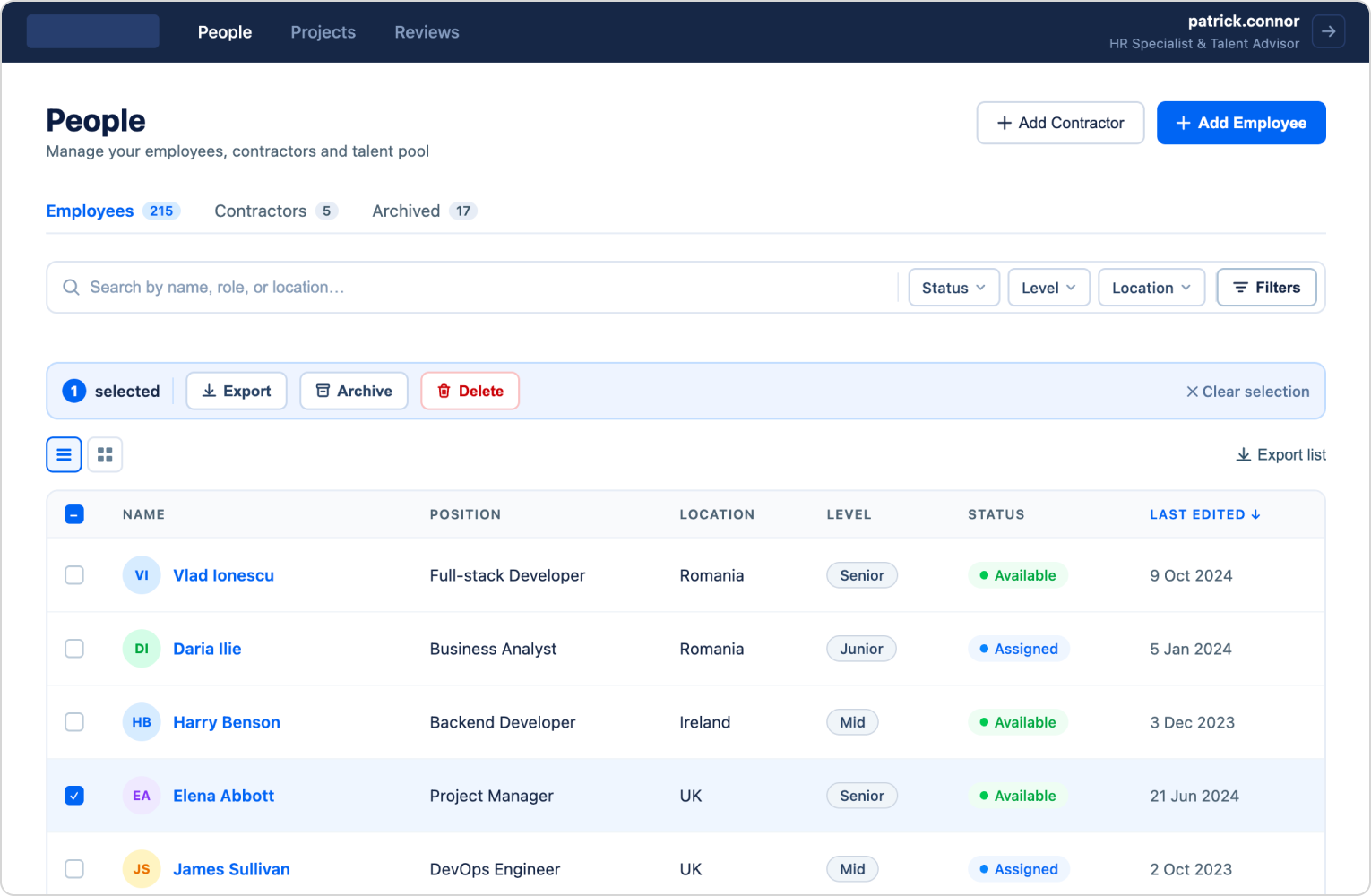
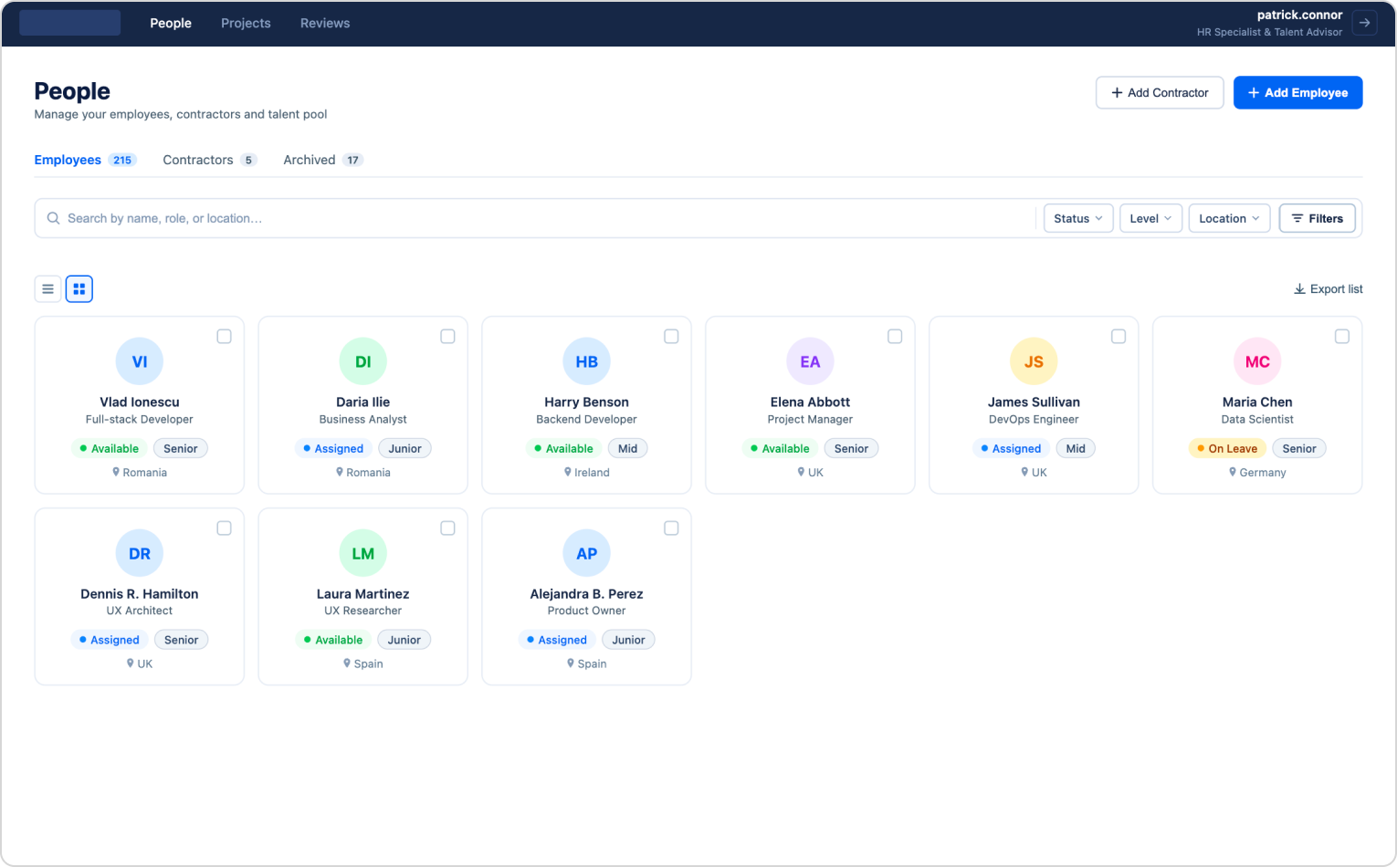
With limited time, our main goal was to make users feel more in control by having core features behave the way they expected them to. Our main priority was fixing search and filtering, since that's where most of the confusion came from.
Search and filtering
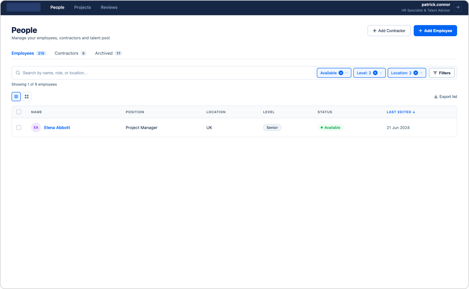
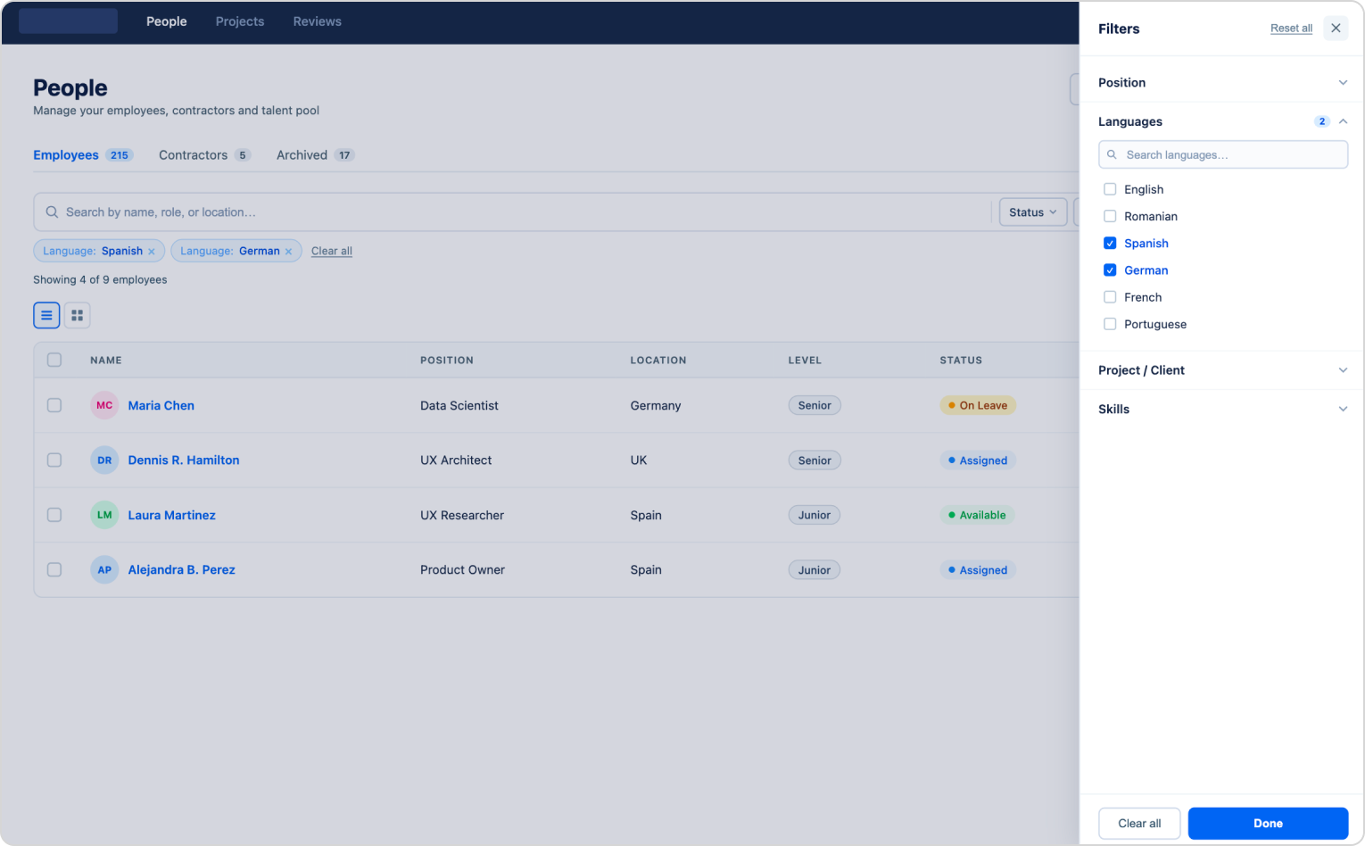
We reworked the search function, which had been hidden behind a hard-to-see button, and moved advanced search into a pop-up modal for easier use. Filters were no longer cluttered, and the interface now had room to breath.
Empty state
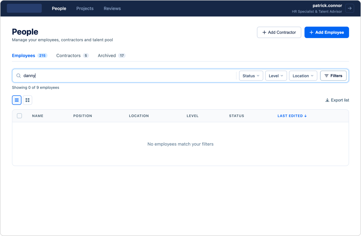
We added a new empty state to prevent confusion when search returned no results.
03 // Outcome
Here's what changed
The redesign made the platform functional and users were now able to successfully achieve their goals with little friction. Engagement rose sharply, and vacancies started getting filled.
+18%
Task completion rate
+30%
More user engagement
+25%
More vacancies filled
Conclusion
When a designer is first brought in, the initial brief rarely describe what's actually wrong. Our job is to look past the stated problem and find the real one. Experience taught me it's almost never a simple adjustment issue, and that assumption is exactly what pushed me to set up user interviews early. For less experienced designers, my advice is to be an information sponge: take in everything people tell you, but hold each account loosely in your mind. It's this ability to hold different perspectives at once that separates a good designer from a great one.